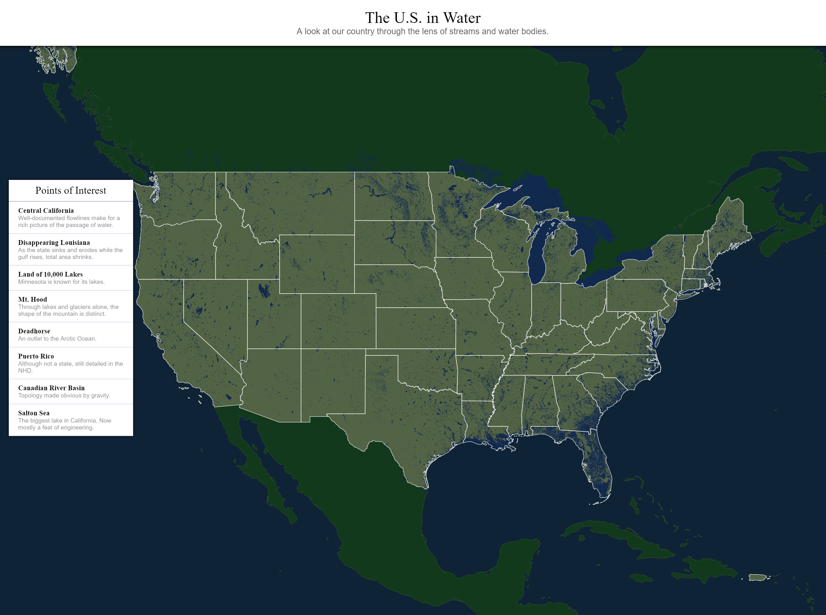
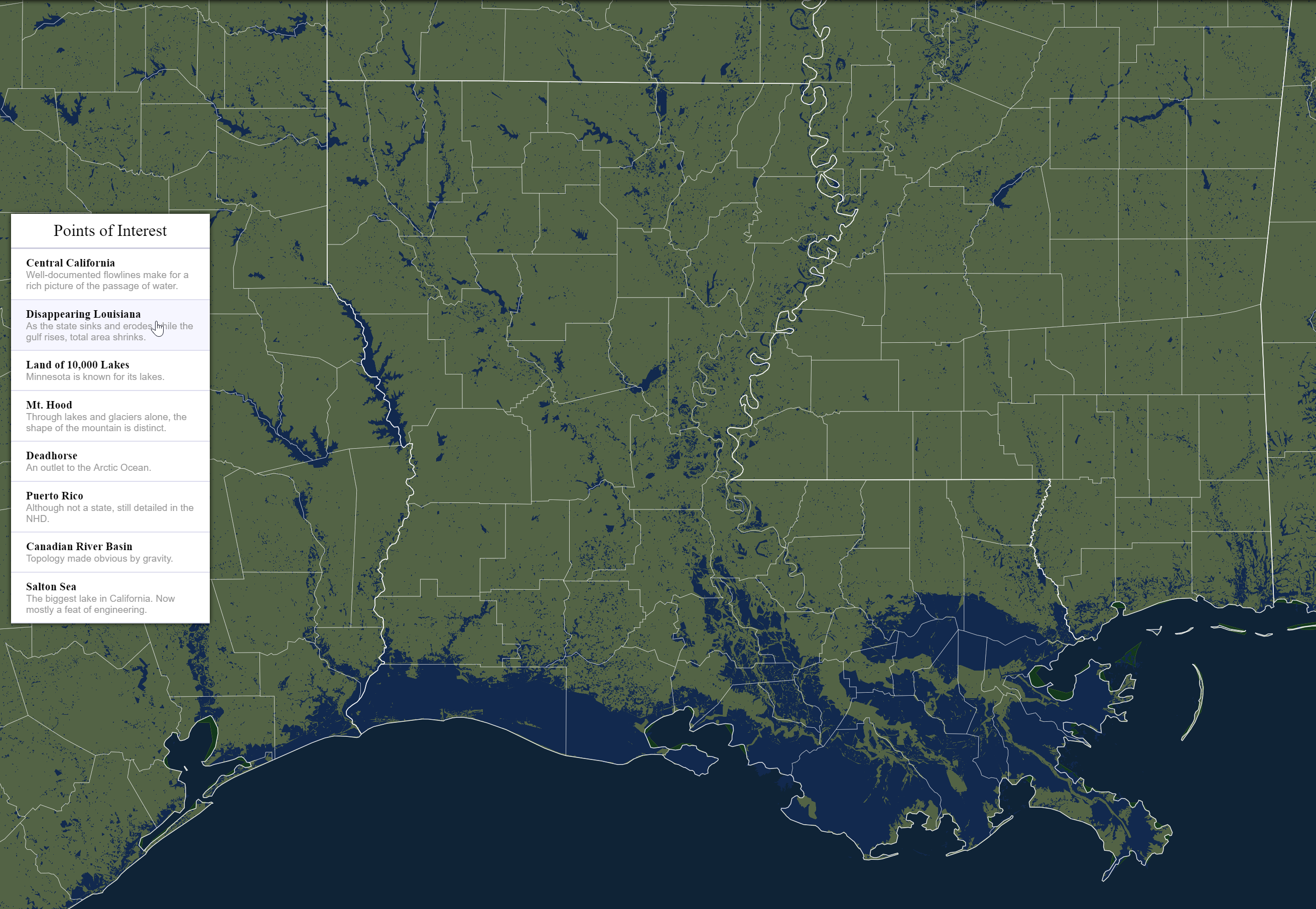
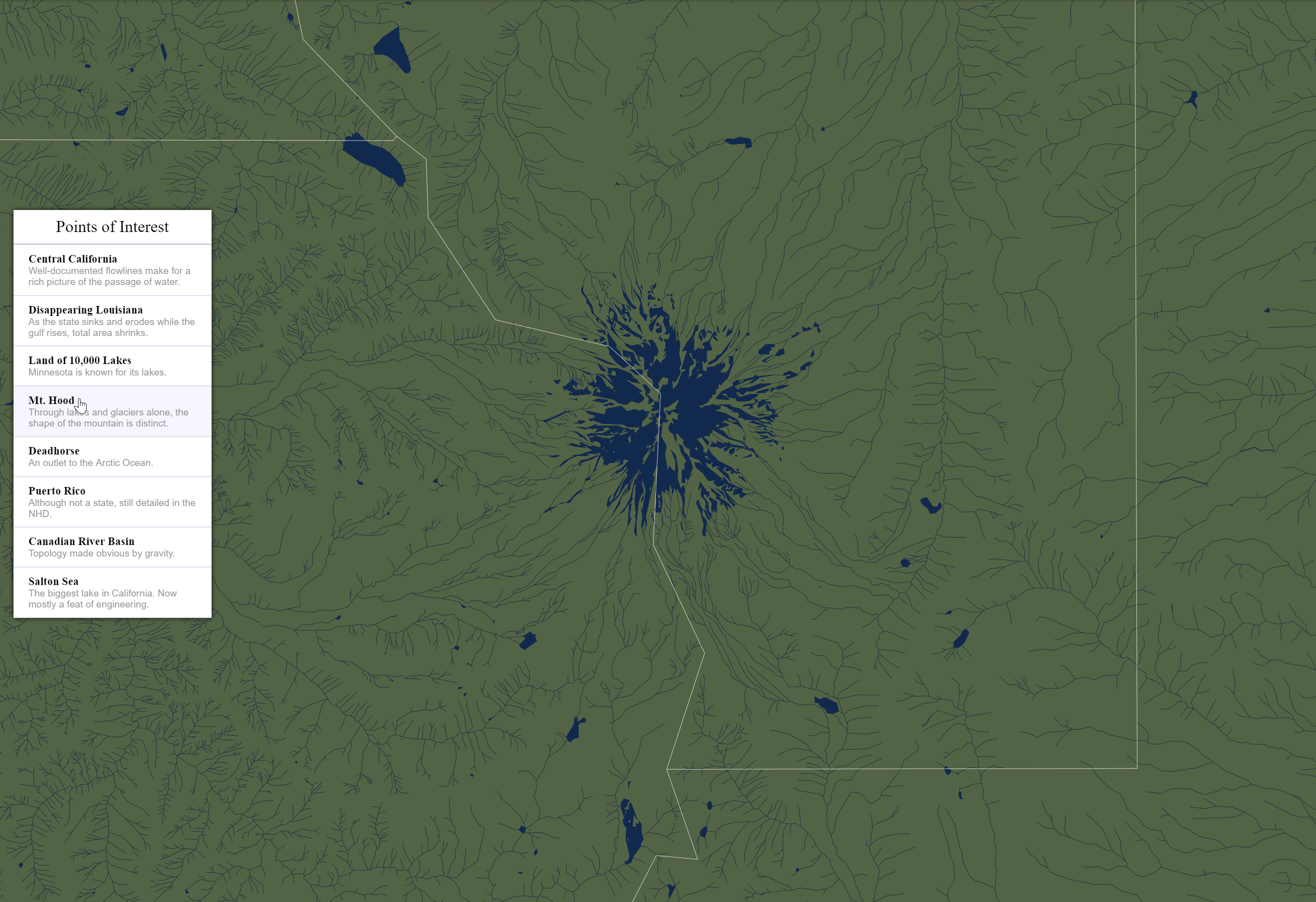
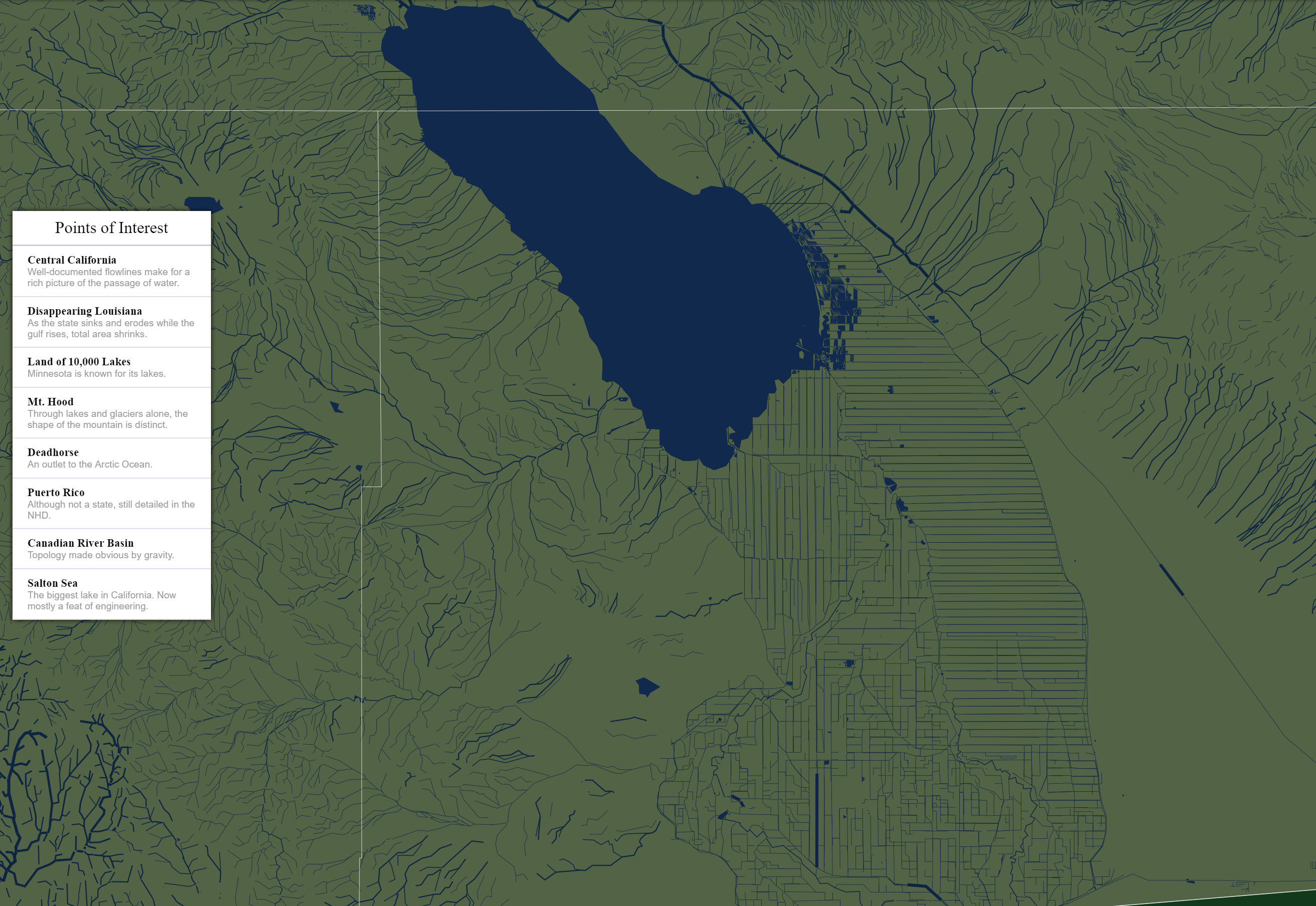
In the summer of 2017, I took a web cartography class. Before this I had dabbled with Google Maps, Leaflet, and Mapbox as a developer, but I hadn't gone deep on any projects. U.S. in Water was my final project, in which I focused on building my own vector map tiles.
The Web Cartography class
From the first day of this class, I was drawn to big datasets that cripple browsers. I tried placing every building in Shanghai on a map. When confronted with performance issues, I added a heatmap layer. When confronted with more performance issues, I wrote my own object tracking using a quadtree and frustrum culling.
This class taught us a lot about manipulating GIS data from both QGIS and the commandline, using tools like topojson and turf.js. I put these tools to use with this needlessly ambitious project that started a simple political statement which led me to a wonderful dataset. The dataset is the National Hydrography Dataset. The political statement was
The people of Standing Rock may not own the land that the North Dakota Access Pipeline was built, but the pipeline will impact the water that flows through Standing Rock. Can I make a map that demonstrates how water moves with no care or understanding of political boundaries. Can I show people that political boundaries may be the letter of the law, but the spirit of the law must consider literal downstream impacts?
Building Vector Tiles
The National Hydrography Dataset (NHD) is a massive dataset detailing all the bodies of water, waterlines, and more in the United States. It took a combination of QGIS, commandline utilities, manual editing, and a lot of trial and error, but I was eventually able to convert the original ArcGIS dataset into geojson for use in other tools. These geojson files were dozens of gigabytes each, totaling over 80GB among them all.
The next step was to process the data using Tippecanoe to make incredibly detailed map tiles. In my head, these would make for a beautifully dense and textured map that really drove home, but in reality, I ran into a lot of issues that made this map come up short.
The first issue is that I am not a domain expert in cartography, watersheds, or any of the other professions that were required to assemble this dataset. I learned as much as I could about flowlines and the scheme of the data, but without a collaboration with experts, I knew this map would under deliver on accuracy. My hubris isn't so large that I didn't see this coming, but it is still worth mentioning.
The second issue was the sheer amount of time it took to process this much data. Generating vector tiles takes a lot of compute power, and despite having quite the beefy PC, processing large files took tens of hours. Fortunately, Tippecanoe can take advantage of any number of CPUs and as much memory as you can throw at it. So I did all my processing in GCP on VMs that had dozens of cores and 100+ GB of RAM. Thankfully I had some GCP credits.
The third issue was tuning parameters to make reasonable vector tiles. Tippecanoe has no issue generating tiles with boundless details, but the consequence is file size. My first attempt resulted in tiles that were over 100 megabytes each. This is unreasonable by every standard. Several iterations later, I landed on a set of tiles that balanced detail and filesize.
Presenting the Vector Tiles
Since I was already processing all this data in GCP, it only made sense to ultimately serve the vector tiles out of Google Cloud Storage. Using a custom tileset is straightforward with Mapbox GL JS, but it means custom coloring every feature. This isn't a hard thing to do, but it can be a lot of work and take serious design consideration if there are enough layers. Fortunately, I only had a handful.
In addition to the NHD tiles, I wanted to present political boundaries to drive home how water flows through these imaginary borders. This was done by querying geojson at runtime and adding those layers on the spot. Since the dataset for states and counties is considerable smaller, this is an acceptable thing to do at runtime.
Going forward
I'm not sure if I'll ever return to this project, but deep down I hope I do. This project, although fun and successful in its own way, was ultimately a letdown. I didn't achieve my goal of expressing the political statement above, and the tiles aren't rich in detail like I wanted.
If I pick this back up, the first thing I need to do is bake raster tiles from the 100 MB vector tiles. I attempted to do this, but I couldn't find any existing projects that did what I needed. I suspect that the mapbox-gl-native library can be repurposed for this, but I haven't experimented with it at all. If I can bake raster tiles, then I get small files as well as detailed tiles.
The second thing I need to do is find a cartographer buddy or hit the books to make sure I represent the data properly. It's very apparent just looking at the map that certain features (especially rivers) are misrepresented. There is no doubt in my mind that the NHD contains the required data to properly represent all water features, I just don't know what I'm doing.
But jumping into the deep-end without knowing what you're doing is half the fun.
Technology used
- ArcGIS
- QGIS
- Geojson
- Make
- GCE
- GCS
- Tippecanoe
- Mapbox GL JS


